
Showing posts with label Photography. Show all posts
Showing posts with label Photography. Show all posts
Tuesday, 8 February 2011
Photographs!
This is a selection of, in my opinion, the best of the photographs I have taken so far. I took 150 but have whittled it down to an unfortunately low 28, never the less I am very happy with how they look and think many of them will be appropriate for my magazine.
My favourite images are the ones taken outside as I think it is a great setting for photos and it gives them an excellent look with the light. My particular favourite are the first three. The first image, which is in the trees, has the element of action and movement which is what I really wanted in the photos. Also it creates an almost gothic look with the dark light and ivy hanging down which fits with my genre. The other two are close ups of my model's face against the grey sky which really helps her purple hair stand out. The wind has created a really great effect in these photos!

Friday, 4 February 2011
Female Musician Photo Inspiration!
Hayley Williams, Paramore! As the most famous front woman around she has made her band what it is, like I am suggest my artist has, her photographs often look very natural and casual which is a good style however you can still see her character.
I really like both these images! They have the action I wanted and are posed but the pose isn't too posey and fake looking, so you still get the model's character coming out.


These three images are very natural and look very pretty. I took images like these as test shots and think they work really well. I would definitely like to include pictures like this in my final magazine and think they will work well on a double page spread.


Victoria Asher, Cobra Starship!
These first two images are quite posed but they look really nice and elegant. I especially like the pose on the right as it looks different to most poses but still nice. The first image uses props which makes it individual and eye catching, which I want! Also I like these two outfits as they are pretty but still look as though they belong in the genre because they are more individual.


 This third image is nice because it is a full body shot but is very natural and the black and white effect works well with her and her style. Like the ones of Hayley Williams this is a very natural, happy picture, which I really love.
I really like both these images! They have the action I wanted and are posed but the pose isn't too posey and fake looking, so you still get the model's character coming out.

These three images are very natural and look very pretty. I took images like these as test shots and think they work really well. I would definitely like to include pictures like this in my final magazine and think they will work well on a double page spread.


Victoria Asher, Cobra Starship!
These first two images are quite posed but they look really nice and elegant. I especially like the pose on the right as it looks different to most poses but still nice. The first image uses props which makes it individual and eye catching, which I want! Also I like these two outfits as they are pretty but still look as though they belong in the genre because they are more individual.


Thursday, 27 January 2011
Playing with Desaturation!


Thursday, 20 January 2011
Test Shots!
I have taken some example photographs using my mock drawings as inspiration. They are all unedited but I will edit the images to use them on the magazine to create the best, professional look photos.

 These images are to test the photo of one of my covers. I think the image works quite well as it is quite active and there is space for the cards to be falling around my model. However I do feel the card is hard to see which may be a problem.

 This is the test of my other mock up cover. I really like this picture as I think the prop being in the foreground works really well and draws focus. Also I think the posture of the model, leaning forward and looking at the camera, as it focuses the reader to her face.

 These photos are really nice. They capture the model well and would look good on a page. I think the first image would work well under the content as it leaves room for the features list.

 I think these images fit with my genre and I like the location. These would work well as a main feature image on my double page spread. Although I feel they would need recolouring with a darker tone.


I love photos like the two above, as they aren't posed they really show the model's natural beauty and their personality. These would be good photos to have in my DPS.


I feel even though I like these images I think they need to be darker to fit with my genre of rock. Also I think I need to make them more 'surreal' as it was a specific feature of my pitch.


I love photos like the two above, as they aren't posed they really show the model's natural beauty and their personality. These would be good photos to have in my DPS.
Monday, 17 January 2011


Inspirational Images
 I like the dark make up that contrasts her skin tone used by this girl in her photo.

The mouse ears are a good use of interesting props and this is added to by her make up. It still keeps the model fashionable with her glasses though.


Good use of head angles.


Blood - fits with genre, dark, sinister, surreal

Nice coloured photograph, and use of props and fashion associated with genre.


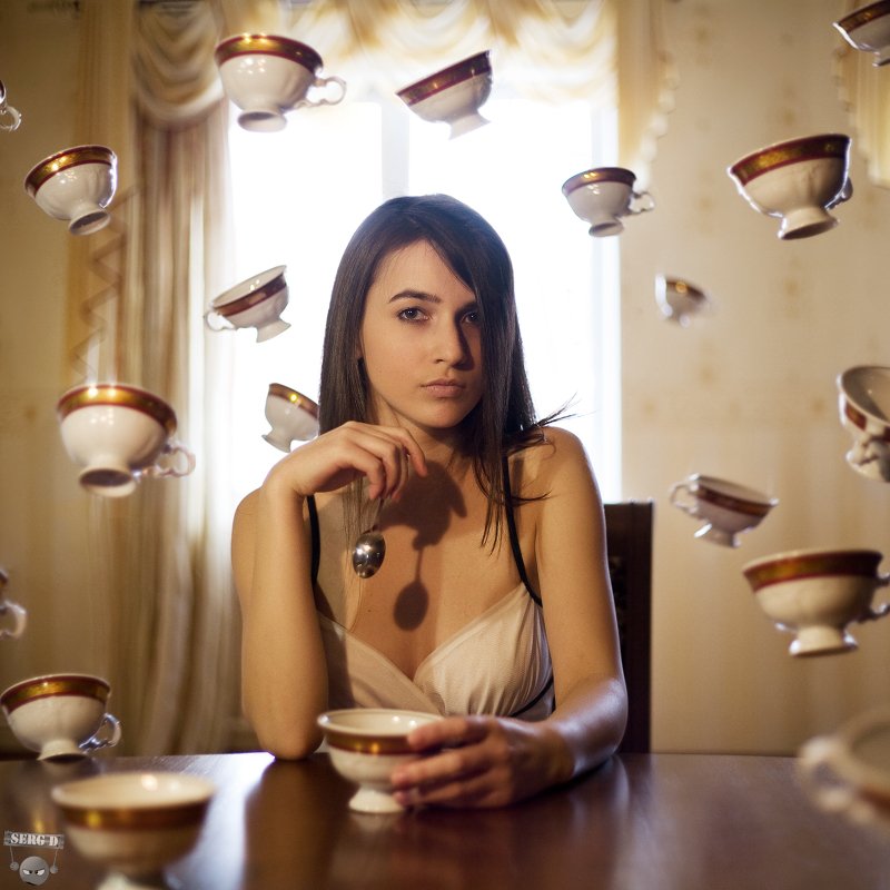
Great use of editing to add to the images. Makes them very individual and eye catching

Tuesday, 4 January 2011
Inspiration
http://mondino-update.net/index.php?page=1
This is a link to the website of French fashion photographer Jean-Baptitse Mondino. I particularly enjoy his photographs because they initially seem to be very traditional shots however each of them has a surreal, unique feature to them. This sets them apart from other photographs. I think this would be a good idea on a magazine cover as it will draw the eye of the buyer.
Some of my favourite photos from Mondino's website, which inspire me the most, are:

I particularly like this image because his attire makes a very bold statement and his pose suggests power, which is a good thing for a magazine cover to instil in the readers mind as it will reflect onto the rest of the magazine.

This is a very contrasting photograph, which I like. The girl is very elegant in her couture, delicate, pastel clothes however she is in the very peculiar setting of a trashed apartment. I think that background and props play an important role really making a photo good. Therefore I must really consider both of these things when taking photos and get a good balance like this.
This is another very contrasting picture. It demonstrates different aspects of youth culture with a smart mod and a group of break dancers. You can instantly see the binary opposites, not only in their clothes but in their postures too. The dancers are all jumping and animated whereas the mod is stationary. I think that the action in the photo makes it really good and it shows that very different people can still go together and look good.
I like this photo because it is very simple and unique. It has used a model who would be stereotypically associated with rock with bright tattoo, long fringe, dark make up and make her look elegant too, because of her black floaty dress. The prop of a microphone is a good thing to use as it relates to the music magazine and is placed with her well.
This is a link to the website of French fashion photographer Jean-Baptitse Mondino. I particularly enjoy his photographs because they initially seem to be very traditional shots however each of them has a surreal, unique feature to them. This sets them apart from other photographs. I think this would be a good idea on a magazine cover as it will draw the eye of the buyer.
Some of my favourite photos from Mondino's website, which inspire me the most, are:

I particularly like this image because his attire makes a very bold statement and his pose suggests power, which is a good thing for a magazine cover to instil in the readers mind as it will reflect onto the rest of the magazine.

This is a very contrasting photograph, which I like. The girl is very elegant in her couture, delicate, pastel clothes however she is in the very peculiar setting of a trashed apartment. I think that background and props play an important role really making a photo good. Therefore I must really consider both of these things when taking photos and get a good balance like this.

This is another very contrasting picture. It demonstrates different aspects of youth culture with a smart mod and a group of break dancers. You can instantly see the binary opposites, not only in their clothes but in their postures too. The dancers are all jumping and animated whereas the mod is stationary. I think that the action in the photo makes it really good and it shows that very different people can still go together and look good.

I like this photo because it is very simple and unique. It has used a model who would be stereotypically associated with rock with bright tattoo, long fringe, dark make up and make her look elegant too, because of her black floaty dress. The prop of a microphone is a good thing to use as it relates to the music magazine and is placed with her well.
Subscribe to:
Posts (Atom)