Wednesday, 19 January 2011

Flat Drafts


These are two rough (disproportioned) drafts of possible magazine covers. I wanted to incorporate cards into the designs as they are quite a cool prop, however I'm not sure how well they will work and so will try them out in a mock of my magazine. Also I incorporate them talking influence from Alice in Wonderland which I think has many excellent artistic influences. In the first design the cards are showing a winning hand of 21 which I could use to emphasise my artist has won over the industry. In the second design the model is reaching out to the ace of spades it is an iconic card. Around the rest of the image I have the idea to photoshop cards falling. The cover lines on both are kept to a minimum which I think is good as it doesn't clutter the page.


This is a draft of my contents page. I have decided to make an image the background of the page and the text then sit over the top, like in the Vibe contents page I analysed.


This is my rough draft of the double page spread. I have tried to incorporate both of the DPS's I analysed using columns in the text however splitting the pages into image and text. I have drawn more than one image to help the personality of my artist come across.

Monday, 17 January 2011

Inspirational Images


Inspirational Images

I like the dark make up that contrasts her skin tone used by this girl in her photo.


The mouse ears are a good use of interesting props and this is added to by her make up. It still keeps the model fashionable with her glasses though.


The forrest setting of this photo is good as it is quite dark and sinister. The editing makes it really stand out and look different.
 Good use of head angles.
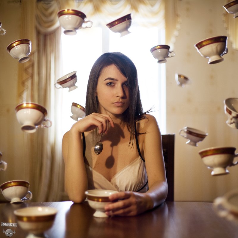
I really love this photo because not only does model look incredible with perfect hair and clothes which fit the genre but it involves the surreal element  I want and action as though the photo was not know about.


Blood - fits with genre, dark, sinister, surreal
Nice coloured photograph, and use of props and fashion associated with genre.


Great use of editing to add to the images. Makes them very individual and eye catching

Friday, 7 January 2011

Pitch!

This is the presentation with my pitch. I had embedded my moodboard clip but it was not able to upload on slideshare.

Wednesday, 5 January 2011

Colour Schemes


Magazine Title

For the title of my magazine I really feel the convention of using only one word is best as it means it would be more catchy and therefore more rememberable for the reader.

Initially I thought a musical term would be appropriate with some sort of rock link as that is the genre I have chosen. The words I think would be good are Encore, Snare,  Plectrum, Crash and Shred. Another idea for my magazine title was to use a term from geological rock to make the title a pun. If I were to do this I would need to find a suitable cross-over word that can be identified with rock music. The words I have found that I feel do both of these are Vein, Petrified and Molten. Out of all these examples I think a musical word would be best and my two final choices are Plectrum and Snare as they are very related to the genre and very important within it as they are key kit for any rock band.

After considering both words as a magazine title and asking for opinions I feel Snare is the best word. I think this because it is a very recognisable word within the music world and particularly the rock word, I also think it has a good ring to it. It isn't a very obvious word which makes it seem more unique.