Hello moderator! Welcome to my media coursework blog, I hope you enjoy it.
As you can see I have chosen to follow the print specification and have created a music magazine, which is in the rock genre.
Once again I hope you enjoy my work and blog!
Sarah :)

Tuesday, 10 May 2011
Thursday, 7 April 2011


Wednesday, 6 April 2011


Thursday, 24 March 2011
Evaluation Task 1
In what ways does your media product use, develop or challenge forms and conventions of real media products? (i.e. of music magazines)
Title
The title my magazine is 'Snare' this greatly follows the conventions of, not just music magazines but all magazines, as most only use one word for example 'Kerrang!', 'NME', 'Clash', 'Vogue' and 'Now'. Also the meaning of the word and it's link to music follows a common convention as it relays to the reader the magazine's genre. As you can see with my previous examples they all link to the genre even if it's slightly more tenuous like 'Kerrang!' being a reference to the sound made on a electric guitar.
Graphology
Front Cover:
Masthead: my masthead spread the width of the front page. Large text is conventionally used for a masthead and it often fills the top of the page, this is because the top third is the part you will instantly see on a shelf so if the title is large and noticeable the reader will be able to find. The font I used for the masthead was a distressed style font, with scrawled bits. This effect is often used on rock magazines to create a grunge look.


 My masthead spans the page and uses a distressed style font just as Kerrang's does.
-Scribbled
Cover Lines: many rock magazines crowd their front covers with lots of cover lines. I tried to keep away from this convention as it often seems hard to read and messy. However I did have to use the convention most mainstream magazines use and include cover lines to fill larger gaps but I still only include 3 main ones. A convention I made sure I stuck to was to have the cover line relating to the main story larger than all the rest so the audience is instantly drawn to it.
Image: most magazines use a shot ranging from a mid to a close up, with the model looking at the audience. This allows them to focus on the person in the photo and give the reader the idea that they need to learn about this important person on the cover. Also because the model is looking out it seems as though they are directly trying to address individuals. I have followed these conventions as the cover is the most important selling point of a magazine and the image is what the reader will mainly look at, so it must be attracting.
Iconography
Costume: my model wore a black top and a black jacket. This dark colour is connected with the rock genre and so I feel this follows the general conventions of stereotypical people in a rock band. She also wore high Doc Martens, which are a style very much associated with rock and indie movements. However she is wearing a contrasting cream skirt and a pretty gold and pearl necklace. These go against many of the conventions of female rockstars because many are considered to be 'tomboys' whilst mine is embracing pretty girly fashions, however paired with her other clothes it creates an alternative look.
Hair: young rock fans often dye their hair bright colours to show their individuality or copy their idols such as Gerard Way, who has red hair, or Jared Leto, who has blue. My model having a darkish purple-red coloured hair is instantly something associated with rock, so this follows the conventions of the genre.
Piercing: my model has a nose piercing, piercing is another stereotypical like of a rock fan. This also helps to show more individuality, which rock bands strive to achieve.
How my artist is represented:
In my magazine I represent my artist as an idol. Someone for the reader to look up to, and aspire to be. This convention of presenting the artists as good people is a convention most magazines keep to. It will help with the sales of the magazine to have optimistic, inspiration stories. Also it will help boost an artist's sale and their fame.
Title
The title my magazine is 'Snare' this greatly follows the conventions of, not just music magazines but all magazines, as most only use one word for example 'Kerrang!', 'NME', 'Clash', 'Vogue' and 'Now'. Also the meaning of the word and it's link to music follows a common convention as it relays to the reader the magazine's genre. As you can see with my previous examples they all link to the genre even if it's slightly more tenuous like 'Kerrang!' being a reference to the sound made on a electric guitar.
Graphology
Front Cover:
Masthead: my masthead spread the width of the front page. Large text is conventionally used for a masthead and it often fills the top of the page, this is because the top third is the part you will instantly see on a shelf so if the title is large and noticeable the reader will be able to find. The font I used for the masthead was a distressed style font, with scrawled bits. This effect is often used on rock magazines to create a grunge look.
 My masthead spans the page and uses a distressed style font just as Kerrang's does.
-Scribbled
Cover Lines: many rock magazines crowd their front covers with lots of cover lines. I tried to keep away from this convention as it often seems hard to read and messy. However I did have to use the convention most mainstream magazines use and include cover lines to fill larger gaps but I still only include 3 main ones. A convention I made sure I stuck to was to have the cover line relating to the main story larger than all the rest so the audience is instantly drawn to it.
Image: most magazines use a shot ranging from a mid to a close up, with the model looking at the audience. This allows them to focus on the person in the photo and give the reader the idea that they need to learn about this important person on the cover. Also because the model is looking out it seems as though they are directly trying to address individuals. I have followed these conventions as the cover is the most important selling point of a magazine and the image is what the reader will mainly look at, so it must be attracting.
Iconography
Costume: my model wore a black top and a black jacket. This dark colour is connected with the rock genre and so I feel this follows the general conventions of stereotypical people in a rock band. She also wore high Doc Martens, which are a style very much associated with rock and indie movements. However she is wearing a contrasting cream skirt and a pretty gold and pearl necklace. These go against many of the conventions of female rockstars because many are considered to be 'tomboys' whilst mine is embracing pretty girly fashions, however paired with her other clothes it creates an alternative look.
Hair: young rock fans often dye their hair bright colours to show their individuality or copy their idols such as Gerard Way, who has red hair, or Jared Leto, who has blue. My model having a darkish purple-red coloured hair is instantly something associated with rock, so this follows the conventions of the genre.
Piercing: my model has a nose piercing, piercing is another stereotypical like of a rock fan. This also helps to show more individuality, which rock bands strive to achieve.
How my artist is represented:
In my magazine I represent my artist as an idol. Someone for the reader to look up to, and aspire to be. This convention of presenting the artists as good people is a convention most magazines keep to. It will help with the sales of the magazine to have optimistic, inspiration stories. Also it will help boost an artist's sale and their fame.
Evaluation Task 2
How does your media product represent particular social groups?
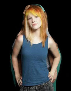


The rock band Paramore would be featured in a magazine similar to mine. Hayley Williams is the lead singer and face of the band and an icon in rock, as Zoe Pacific is in my band. The one of HW includes the rest of her band although I have only focused on her. It is a mid-shot, however it is still very similar to the more close up image I have featured on my cover. I feel the poses mirror each other as they both have their hands on their hips. Their brightly coloured hair is also very fitting and stereotypical of the rock social group. Also they are both looking directly at the camera, which seems to directly address the reader as though they are looking at them. However the facial expression of the two are very different. HW is smiling whereas ZP has a more intensive look. Their clothing is also very contrast as HW is wearing a casual mixture of jeans and a plain top whilst ZP is wearing very dark clothes, which are usually more associated with rock. I think the features I have demonstrated in HW's photo reflect her bands more playful, pop genre of rock, whilst ZP is really channeling an air of a very serious rock band. I think this obvious look of rock represents a large amount of rock fans as the style of dark colours my model is wearing is associated rock and many fans often take music very seriously.
Evaluation Task 3
What kind of media institution might distribute your media product and why?
A publishing company works to make information provided in books, newspapers, magazines and also now webpages and electronic publications available for all to see. Publishing companies are extremely important in magazine production as they distribute the final product to their target audience.
The publishing company that would distribute my magazine:
Subscribe to:
Posts (Atom)