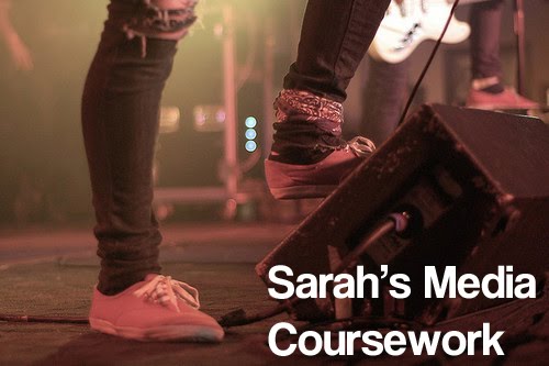
Hello moderator! Welcome to my media coursework blog, I hope you enjoy it.
As you can see I have chosen to follow the print specification and have created a music magazine, which is in the rock genre.
Once again I hope you enjoy my work and blog!
Sarah :)
Tuesday 10 May 2011
Thursday 7 April 2011


Wednesday 6 April 2011


Thursday 24 March 2011
Evaluation Task 1
In what ways does your media product use, develop or challenge forms and conventions of real media products? (i.e. of music magazines)
Title
The title my magazine is 'Snare' this greatly follows the conventions of, not just music magazines but all magazines, as most only use one word for example 'Kerrang!', 'NME', 'Clash', 'Vogue' and 'Now'. Also the meaning of the word and it's link to music follows a common convention as it relays to the reader the magazine's genre. As you can see with my previous examples they all link to the genre even if it's slightly more tenuous like 'Kerrang!' being a reference to the sound made on a electric guitar.
Graphology
Front Cover:
Masthead: my masthead spread the width of the front page. Large text is conventionally used for a masthead and it often fills the top of the page, this is because the top third is the part you will instantly see on a shelf so if the title is large and noticeable the reader will be able to find. The font I used for the masthead was a distressed style font, with scrawled bits. This effect is often used on rock magazines to create a grunge look.


 My masthead spans the page and uses a distressed style font just as Kerrang's does.
-Scribbled
Cover Lines: many rock magazines crowd their front covers with lots of cover lines. I tried to keep away from this convention as it often seems hard to read and messy. However I did have to use the convention most mainstream magazines use and include cover lines to fill larger gaps but I still only include 3 main ones. A convention I made sure I stuck to was to have the cover line relating to the main story larger than all the rest so the audience is instantly drawn to it.
Image: most magazines use a shot ranging from a mid to a close up, with the model looking at the audience. This allows them to focus on the person in the photo and give the reader the idea that they need to learn about this important person on the cover. Also because the model is looking out it seems as though they are directly trying to address individuals. I have followed these conventions as the cover is the most important selling point of a magazine and the image is what the reader will mainly look at, so it must be attracting.
Iconography
Costume: my model wore a black top and a black jacket. This dark colour is connected with the rock genre and so I feel this follows the general conventions of stereotypical people in a rock band. She also wore high Doc Martens, which are a style very much associated with rock and indie movements. However she is wearing a contrasting cream skirt and a pretty gold and pearl necklace. These go against many of the conventions of female rockstars because many are considered to be 'tomboys' whilst mine is embracing pretty girly fashions, however paired with her other clothes it creates an alternative look.
Hair: young rock fans often dye their hair bright colours to show their individuality or copy their idols such as Gerard Way, who has red hair, or Jared Leto, who has blue. My model having a darkish purple-red coloured hair is instantly something associated with rock, so this follows the conventions of the genre.
Piercing: my model has a nose piercing, piercing is another stereotypical like of a rock fan. This also helps to show more individuality, which rock bands strive to achieve.
How my artist is represented:
In my magazine I represent my artist as an idol. Someone for the reader to look up to, and aspire to be. This convention of presenting the artists as good people is a convention most magazines keep to. It will help with the sales of the magazine to have optimistic, inspiration stories. Also it will help boost an artist's sale and their fame.
Title
The title my magazine is 'Snare' this greatly follows the conventions of, not just music magazines but all magazines, as most only use one word for example 'Kerrang!', 'NME', 'Clash', 'Vogue' and 'Now'. Also the meaning of the word and it's link to music follows a common convention as it relays to the reader the magazine's genre. As you can see with my previous examples they all link to the genre even if it's slightly more tenuous like 'Kerrang!' being a reference to the sound made on a electric guitar.
Graphology
Front Cover:
Masthead: my masthead spread the width of the front page. Large text is conventionally used for a masthead and it often fills the top of the page, this is because the top third is the part you will instantly see on a shelf so if the title is large and noticeable the reader will be able to find. The font I used for the masthead was a distressed style font, with scrawled bits. This effect is often used on rock magazines to create a grunge look.
 My masthead spans the page and uses a distressed style font just as Kerrang's does.
-Scribbled
Cover Lines: many rock magazines crowd their front covers with lots of cover lines. I tried to keep away from this convention as it often seems hard to read and messy. However I did have to use the convention most mainstream magazines use and include cover lines to fill larger gaps but I still only include 3 main ones. A convention I made sure I stuck to was to have the cover line relating to the main story larger than all the rest so the audience is instantly drawn to it.
Image: most magazines use a shot ranging from a mid to a close up, with the model looking at the audience. This allows them to focus on the person in the photo and give the reader the idea that they need to learn about this important person on the cover. Also because the model is looking out it seems as though they are directly trying to address individuals. I have followed these conventions as the cover is the most important selling point of a magazine and the image is what the reader will mainly look at, so it must be attracting.
Iconography
Costume: my model wore a black top and a black jacket. This dark colour is connected with the rock genre and so I feel this follows the general conventions of stereotypical people in a rock band. She also wore high Doc Martens, which are a style very much associated with rock and indie movements. However she is wearing a contrasting cream skirt and a pretty gold and pearl necklace. These go against many of the conventions of female rockstars because many are considered to be 'tomboys' whilst mine is embracing pretty girly fashions, however paired with her other clothes it creates an alternative look.
Hair: young rock fans often dye their hair bright colours to show their individuality or copy their idols such as Gerard Way, who has red hair, or Jared Leto, who has blue. My model having a darkish purple-red coloured hair is instantly something associated with rock, so this follows the conventions of the genre.
Piercing: my model has a nose piercing, piercing is another stereotypical like of a rock fan. This also helps to show more individuality, which rock bands strive to achieve.
How my artist is represented:
In my magazine I represent my artist as an idol. Someone for the reader to look up to, and aspire to be. This convention of presenting the artists as good people is a convention most magazines keep to. It will help with the sales of the magazine to have optimistic, inspiration stories. Also it will help boost an artist's sale and their fame.
Evaluation Task 2
How does your media product represent particular social groups?
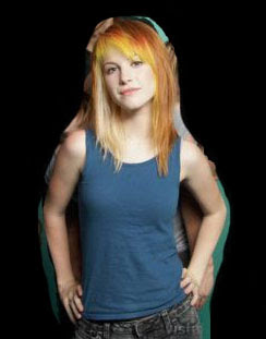


The rock band Paramore would be featured in a magazine similar to mine. Hayley Williams is the lead singer and face of the band and an icon in rock, as Zoe Pacific is in my band. The one of HW includes the rest of her band although I have only focused on her. It is a mid-shot, however it is still very similar to the more close up image I have featured on my cover. I feel the poses mirror each other as they both have their hands on their hips. Their brightly coloured hair is also very fitting and stereotypical of the rock social group. Also they are both looking directly at the camera, which seems to directly address the reader as though they are looking at them. However the facial expression of the two are very different. HW is smiling whereas ZP has a more intensive look. Their clothing is also very contrast as HW is wearing a casual mixture of jeans and a plain top whilst ZP is wearing very dark clothes, which are usually more associated with rock. I think the features I have demonstrated in HW's photo reflect her bands more playful, pop genre of rock, whilst ZP is really channeling an air of a very serious rock band. I think this obvious look of rock represents a large amount of rock fans as the style of dark colours my model is wearing is associated rock and many fans often take music very seriously.
Evaluation Task 3
What kind of media institution might distribute your media product and why?
A publishing company works to make information provided in books, newspapers, magazines and also now webpages and electronic publications available for all to see. Publishing companies are extremely important in magazine production as they distribute the final product to their target audience.
The publishing company that would distribute my magazine:
Evaluation Task 5
How did you attract/address your audience?
Front Cover:
On my front cover I have done many things to appeal to the audience as the cover is what they will first see even before they buy it.
 -Title: the title of 'Snare' should hopefully appeal to rock music fans because they will understand the meaning and it's relation to drums and their preferred genre.
-Masthead: the masthead will also appeal and attract because the font is distressed which is a preferred feature of rock magazines. It is written in a huge bold size and is quite a dark yet still eye catching colour both of which will really catch the eye and draw in the audience.
 -Cover lines: the cover lines I have included will appeal because the existing bands I have mentioned are popular and will hopefully draw buyers in as they will see the names of the bands they like and instantly want to know more about why their featured in the magazine and what they can find out about them. Also the main cover line will attract the reader as not only is it larger but as the band is supposedly very new they will be more popular and interesting so the audience will see it as more of an exclusive and be inclined to read on.
 -Plug: offering something free with magazine with attract an audience because a free gift is quite desirable, especially if it relates to something your interested in such as rock music. So giving away a CD with free music will really attract the dedicated rock target audience.
-Image: the image I have used fills the page which is generally pretty eye catching. The model has bright dyed hair and is wearing dark clothes, both typically associated with rock, which will attract the target audience of rock fans. Finally the model is looking out of the page almost at the reader which appeals because the reader will feel as they are being specifically address.
Contents:
-Band's featured: the famous bands featured will again appeal to the target audience as they are bands they will like. The brief description will entice the audience to want to read that article and know more about what they are saying.
 -Plug: the plug I have used on this page of mentioning a contest will appeal to the audience because they will want to see if they have won.
DPS:
-Article: the article is the main piece on this page. It is basically what the target audience bought the magazine for, so it too must appeal to the reader. To achieve this I have really tried to create humour in the interview which will make it more entertaining for the reader. Also the 'exclusive' new information provided in the interview will appeal to the reader because they will want to know and enjoy knowing about their favourite artist's life, as it will allow them to feel closer to them and possibly relate to them more. Also it will allow them to feel knowledgable and cool if they know things about new band that others don't.
 -Pull quote: exemplifying an inspirational quote will really appeal to an audience because it's the first thing they'll see and then they'll want to read more. Also it will help them to relate to the featured artist and look up to them, if they agree.
-Images: the multiple, pretty images will attract the reader because the artist they like will look perfect, as they ideally want them to look.
Front Cover:
On my front cover I have done many things to appeal to the audience as the cover is what they will first see even before they buy it.

-Masthead: the masthead will also appeal and attract because the font is distressed which is a preferred feature of rock magazines. It is written in a huge bold size and is quite a dark yet still eye catching colour both of which will really catch the eye and draw in the audience.
-Image: the image I have used fills the page which is generally pretty eye catching. The model has bright dyed hair and is wearing dark clothes, both typically associated with rock, which will attract the target audience of rock fans. Finally the model is looking out of the page almost at the reader which appeals because the reader will feel as they are being specifically address.
Contents:
-Band's featured: the famous bands featured will again appeal to the target audience as they are bands they will like. The brief description will entice the audience to want to read that article and know more about what they are saying.

DPS:
-Article: the article is the main piece on this page. It is basically what the target audience bought the magazine for, so it too must appeal to the reader. To achieve this I have really tried to create humour in the interview which will make it more entertaining for the reader. Also the 'exclusive' new information provided in the interview will appeal to the reader because they will want to know and enjoy knowing about their favourite artist's life, as it will allow them to feel closer to them and possibly relate to them more. Also it will allow them to feel knowledgable and cool if they know things about new band that others don't.
-Images: the multiple, pretty images will attract the reader because the artist they like will look perfect, as they ideally want them to look.
Evaluation Task 7
Looking back at your preliminary task (the school magazine task) what do you feel you have learnt in the progression from it to full product?


For my final I used a large convention of a magazine contents page to have the text in columns. This makes it easier to read than the contents of my prelim. I also make the artist name (the part before the colon) bold on my final which really focuses on the main part of the story which helps the reader to know what its about, which I didn't do on the contents which actually makes the text a little confusing.
I created an identity on my final by repeating the magazine name which allows the reader to know the pages are all part of the same magazine. I didn't do this on my prelim which doesn't really help the reader to know the magazine and it's genre.
Another convention of a contents page I made use of on my final product's contents is using images. The use of multiple images make it more interesting for the reader as they showcase more of the context of the magazine and make the page much more interesting, which will appeal to the reader. My prelim's contents is very bland and plain which really wouldn't help to catch the readers attention.
After doing my prelim I was able to do a large amount of research which allowed my to find out more of the conventions of magazines, such as layout, positioning of text and image style. I specifically look at rock music magazines so I could really find out how to make it look as though it actually belonged to that genre, this is why I drastically altered the layout of my contents page as it fits with existing rock magazine's contents styles. I was also able to learn more skills on photoshop, which are clearly visible, as the text manipulation looks a lot more professional and the images look a lot better. This is through becoming more confident at cutting out mages and by using the image editing to increase contrast and brightness to create a more eye catching image.


For my prelim cover I used a mid-shot, which I centred in the page. This meant there were very awkward spaces on my page where cover lines didn't really fit. So on my final product I used a larger medium close up, this fills the page more. I feel this image will attract the reader much more than the first one as it's size is bolder and more eye-catching. Also in my first image the model is looking away which breaks the conventions of a cover model, so in my final product I made sure the model was looking to entice the reader.
I realised from my prelim that a masthead must be very bold and eye catching. This is why I chosen a larger font in my final. I also altered my colour schemes to darker, more contrasting colours as this is will draw the reader more than the paler, dull colours I used in my prelim.
The cover lines I used on my prelim overlapped on the edges of the images and as they are both dark colours this means they are hard to read. They were also the same size on the prelim. So on the final cover I made sure the other cover lines didn't cross the image. However I made the main cover line larger, which focuses the reader on the main story in the magazine, and placed it across the image. To allow the reader to actually be able to read this I made sure the colours were highly contrasting.


For my final I used a large convention of a magazine contents page to have the text in columns. This makes it easier to read than the contents of my prelim. I also make the artist name (the part before the colon) bold on my final which really focuses on the main part of the story which helps the reader to know what its about, which I didn't do on the contents which actually makes the text a little confusing.
I created an identity on my final by repeating the magazine name which allows the reader to know the pages are all part of the same magazine. I didn't do this on my prelim which doesn't really help the reader to know the magazine and it's genre.
Another convention of a contents page I made use of on my final product's contents is using images. The use of multiple images make it more interesting for the reader as they showcase more of the context of the magazine and make the page much more interesting, which will appeal to the reader. My prelim's contents is very bland and plain which really wouldn't help to catch the readers attention.
After doing my prelim I was able to do a large amount of research which allowed my to find out more of the conventions of magazines, such as layout, positioning of text and image style. I specifically look at rock music magazines so I could really find out how to make it look as though it actually belonged to that genre, this is why I drastically altered the layout of my contents page as it fits with existing rock magazine's contents styles. I was also able to learn more skills on photoshop, which are clearly visible, as the text manipulation looks a lot more professional and the images look a lot better. This is through becoming more confident at cutting out mages and by using the image editing to increase contrast and brightness to create a more eye catching image.
Thursday 10 March 2011
What I am doing now?
After receiving feedback on my drafts I have now started to develop my final magazine pages. Here my action list:
Front Cover
-Edit image (remove model's roots and moles): Done
-Move the date and other plugs to allow more details
-Add more coverlines
Contents
-Completely re-think layout: Done
-Add more features: Done
-Consider other smaller images (maybe relating to 'Regulars'): Done
-Incorporate more of the magazine's identity: Done
DPS
-Develop article: Done
-Adjust the layout to make the main image the one that shows most photographic talents: Done
-Add the new questions into the article and adjust the layout accordingly (add a pull quote, a common feature of DPS): Done
-Edit the brightness/saturation on any photographs use to make them fit together (also edit any of the model's roots if they are visible): Done
Draft Feedback - Peer
I asked a selection of my target audience the evaluation questionnaire I previously posted.
With the questions asking whether the magazine represents the rock genre most of the answers were very positive.The magazine name of Snare is praised as it is said it 'has large connotations with the rock genre'. There were different views on my colour scheme with one person saying it contrasts well and another suggesting that darker colours are associated with the rock genre and that the colours I have used do not reflect that. One comment about my images was that 'YES (they do reflect the rock genre) because of the black clothes, graffiti and the trees reminds me of the cure's song "a forest" which had a huge influence on modern music and specifically rock and alternative today'. This demonstrates that I have met the stereotypical view of the genre with most of the elements in my magazine.
One set of peer answers that are very insightful for analysis of the magazine:1. I like how bold it comes across with the mahooosive font
2. Rock
3. (what are plugs?) yes?! i like free cds
4. The contents seem well focused
5. YES because of the black clothes, graffiti and the trees reminds me of the cure's song "a forest" which had a huge influence on modern music and specifically rock and alternative today
6. I like how the colours contrast to the images, it makes the font stand out, so people are drawn to read the article
7. Yes! there could be more blue font on the front cover though, so that the blue is consistent throughout
8. The article is extremely well written and flows well- you believe that this was an actual interview between two people. This is why I found it very interesting and believable as an actual rock magazine article.
9. The double page spread looks very professional- the title font catches the eye and the images are well picked.
10. I'd say maybe put a few more headlines on the front but other than that it's awesome.
Monday 7 March 2011
Initial Corrects
I have started altering my work following my teacher and peer feedback.
To start with I have changed the double page spread as my teacher said to create more focus on the smaller image. I have readjusted the placement and use of the images, making the smaller image larger to fill half the page as it makes more of an impact on the reader. I then used two portrait images to fill the rest of the page which highlights the musician.

To start with I have changed the double page spread as my teacher said to create more focus on the smaller image. I have readjusted the placement and use of the images, making the smaller image larger to fill half the page as it makes more of an impact on the reader. I then used two portrait images to fill the rest of the page which highlights the musician.

Friday 4 March 2011

Monday 28 February 2011
Audience Questionnaire
1. If you saw this magazine on a shelf would you be interested?
2. What genre would you instantly think this magazine was?
3. Are the cover lines and plugs interesting?
4. Is the contents clear?
5. Do the images relate to the genre (rock)?
6. Does the colour scheme relate to the genre?
7. Does the colour scheme attract the eye?
8. Is the article interesting?
9. Does the Double Page Spread fit together well?
10. Is there anything else to suggest to improve my magazine?
Thursday 10 February 2011
Final Decisions for Drafts!
Front Page
The fonts I have used on my cover are ones that I hadn't actually previously considered, however when I found them I felt they were very appropriate for my magazine.
I decided for my front page to use the font Illuminate for my masthead. It is an almost scribbled font which I felt worked well but I font that by making it bold it became solid and made more of an impact.
 The font I used for cover lines was similar to Illuminate, in that it looks scribbled. [ank]* is a very scribbled font. I think it looks really good on the page as it's distressed look is different.

The colour scheme I decided on was dark purple, white and black. With black and purple being dark colours they contrasted well against bright white which made the text really stand out. On a cover line I had to switch from white to black to allow the text to be read against my model's dark clothing, I think this has a really eye catching effect.

My image was a mid-shot which I hadn't considered in my mocks but as I found whilst making them it was hard to find space for the text I wanted around a large, full image. Also it really fits to the conventions of a magazine!
Contents
I used [ank]* again on this page too, as well as the same colour scheme, but as the heading font this time. I wanted to repeat the font to keep continuity through the magazine. I also used Helvetica to present the magazine's content, it is a good font which I will repeat for my double page spread as this will also be continuity which reflects professionalism.
Double Page Spread
For the heading on this page I used one that I considered originally, Monbijoux. I chose this font because its eye catching and pretty cool, and even though its quite decorative it's still got a rockier feel as it's random and really quite surreal. Also it helps to convey personality in the article.

I used Helvetica for my actual article. It is a nice, clean font which is easily read so it was very appropriate for the task.
The colour scheme I used for this page was new. I decided on black, white and a darkish turquoise, blue. I used white for my background as the other colours contrast nicely over it. As you can see I alternated the other colours in my heading, I felt this would break up and add more of a effect to the reading and the repetition. I used black for the answers in the article and the bluey colour for the questions, this helps to differentiate the two elements of the article and makes it more colourful and interesting.

The fonts I have used on my cover are ones that I hadn't actually previously considered, however when I found them I felt they were very appropriate for my magazine.
I decided for my front page to use the font Illuminate for my masthead. It is an almost scribbled font which I felt worked well but I font that by making it bold it became solid and made more of an impact.

The colour scheme I decided on was dark purple, white and black. With black and purple being dark colours they contrasted well against bright white which made the text really stand out. On a cover line I had to switch from white to black to allow the text to be read against my model's dark clothing, I think this has a really eye catching effect.
My image was a mid-shot which I hadn't considered in my mocks but as I found whilst making them it was hard to find space for the text I wanted around a large, full image. Also it really fits to the conventions of a magazine!
Contents
I used [ank]* again on this page too, as well as the same colour scheme, but as the heading font this time. I wanted to repeat the font to keep continuity through the magazine. I also used Helvetica to present the magazine's content, it is a good font which I will repeat for my double page spread as this will also be continuity which reflects professionalism.
Double Page Spread
For the heading on this page I used one that I considered originally, Monbijoux. I chose this font because its eye catching and pretty cool, and even though its quite decorative it's still got a rockier feel as it's random and really quite surreal. Also it helps to convey personality in the article.

I used Helvetica for my actual article. It is a nice, clean font which is easily read so it was very appropriate for the task.
The colour scheme I used for this page was new. I decided on black, white and a darkish turquoise, blue. I used white for my background as the other colours contrast nicely over it. As you can see I alternated the other colours in my heading, I felt this would break up and add more of a effect to the reading and the repetition. I used black for the answers in the article and the bluey colour for the questions, this helps to differentiate the two elements of the article and makes it more colourful and interesting.


Tuesday 8 February 2011
Photographs!
This is a selection of, in my opinion, the best of the photographs I have taken so far. I took 150 but have whittled it down to an unfortunately low 28, never the less I am very happy with how they look and think many of them will be appropriate for my magazine.
My favourite images are the ones taken outside as I think it is a great setting for photos and it gives them an excellent look with the light. My particular favourite are the first three. The first image, which is in the trees, has the element of action and movement which is what I really wanted in the photos. Also it creates an almost gothic look with the dark light and ivy hanging down which fits with my genre. The other two are close ups of my model's face against the grey sky which really helps her purple hair stand out. The wind has created a really great effect in these photos!
Friday 4 February 2011
Female Musician Photo Inspiration!
Hayley Williams, Paramore! As the most famous front woman around she has made her band what it is, like I am suggest my artist has, her photographs often look very natural and casual which is a good style however you can still see her character.
I really like both these images! They have the action I wanted and are posed but the pose isn't too posey and fake looking, so you still get the model's character coming out.


These three images are very natural and look very pretty. I took images like these as test shots and think they work really well. I would definitely like to include pictures like this in my final magazine and think they will work well on a double page spread.


Victoria Asher, Cobra Starship!
These first two images are quite posed but they look really nice and elegant. I especially like the pose on the right as it looks different to most poses but still nice. The first image uses props which makes it individual and eye catching, which I want! Also I like these two outfits as they are pretty but still look as though they belong in the genre because they are more individual.


 This third image is nice because it is a full body shot but is very natural and the black and white effect works well with her and her style. Like the ones of Hayley Williams this is a very natural, happy picture, which I really love.
I really like both these images! They have the action I wanted and are posed but the pose isn't too posey and fake looking, so you still get the model's character coming out.

These three images are very natural and look very pretty. I took images like these as test shots and think they work really well. I would definitely like to include pictures like this in my final magazine and think they will work well on a double page spread.


Victoria Asher, Cobra Starship!
These first two images are quite posed but they look really nice and elegant. I especially like the pose on the right as it looks different to most poses but still nice. The first image uses props which makes it individual and eye catching, which I want! Also I like these two outfits as they are pretty but still look as though they belong in the genre because they are more individual.


Sunday 30 January 2011
Thursday 27 January 2011
Playing with Desaturation!


Test Shot, Mock Ups!

This is my first mock cover, it is not one of my paper based ones but a new creation that was inspired by one of by images. I have added a free item as a lure for my magazine, and I chose a CD as it is a regular item for a rock magazine to give for free and fits with the music.
I really like the fonts I have used as they are scribbled and look rough. Especially the masthead font which I think really fits with the genre of rock.
I have desaturated the image to give it the darker look which I think reflects the rock genre and looks really nice.


I think the dark red is a great colour and works well as the masthead.
What I don't like about this cover is that there is no actual room for the masthead to spread across the page, which I don't think looks as good as the previous mock where it fills the top third.
This is a mock contents page I have created. I have used an existing photo from the internet with the kind of space in the background that I would want on mine. However although the image is very fitting in the rock genre the colour and lighting is not in keeping with the images that I have taken myself. When taking an image for my actual contents I will need to be sure the images look relatively consistent.
I like this image because of the space which allows text. Also I really like the pose and clothing as it fits in with the rock genre, also the pose is more action which I like.
The font I have used is a continuation on the front page. I think this works well because it will keep consistency which helps professionalism. The text I used for the words was Helvetica which is a clear, easy to read font and will work well as the font through out the magazine.

This is the mock DPS I have made from my flat plans. I have used a bold, decorative text in the heading to help the page and the actual title and subject stand out.
The large image I have used works really well, I think it is a good picture and really shows the artist. However this is not following my mock plans as I intended to have more than one image but which such a statement image, multiple images on top of this doesn't work too well. I my have to re consider this to show more of the artist and photographic skill.
Thursday 20 January 2011
Artist Profile

Age: 19
Band Name: North SkY
Debut Album: Greatest Hits
Years Active: 2011-
History: The three members formed the band at college when they were 16. They busked on the streets of their city of Leicester and finally started performing gigs and battle of the bands in small local venues. After they finished college, in 2010, they all committed to the band and fought for meetings with producers, until one finally realised their talent. Shortly after that at the beginning of 2011 they released their incredibly successful album Greatest Hits.
Philosophy: Live life following any passions
Inspiration: Life, Space, The Sky, Friends
Musical Influences: Green Day, The Horrors, Good Charlotte, David Bowie, The Sex Pistols and The Who
Test Shots!
I have taken some example photographs using my mock drawings as inspiration. They are all unedited but I will edit the images to use them on the magazine to create the best, professional look photos.

 These images are to test the photo of one of my covers. I think the image works quite well as it is quite active and there is space for the cards to be falling around my model. However I do feel the card is hard to see which may be a problem.

 This is the test of my other mock up cover. I really like this picture as I think the prop being in the foreground works really well and draws focus. Also I think the posture of the model, leaning forward and looking at the camera, as it focuses the reader to her face.

 These photos are really nice. They capture the model well and would look good on a page. I think the first image would work well under the content as it leaves room for the features list.

 I think these images fit with my genre and I like the location. These would work well as a main feature image on my double page spread. Although I feel they would need recolouring with a darker tone.


I love photos like the two above, as they aren't posed they really show the model's natural beauty and their personality. These would be good photos to have in my DPS.


I feel even though I like these images I think they need to be darker to fit with my genre of rock. Also I think I need to make them more 'surreal' as it was a specific feature of my pitch.


I love photos like the two above, as they aren't posed they really show the model's natural beauty and their personality. These would be good photos to have in my DPS.
Subscribe to:
Posts (Atom)