Sunday 30 January 2011
Thursday 27 January 2011
Playing with Desaturation!


Test Shot, Mock Ups!

This is my first mock cover, it is not one of my paper based ones but a new creation that was inspired by one of by images. I have added a free item as a lure for my magazine, and I chose a CD as it is a regular item for a rock magazine to give for free and fits with the music.
I really like the fonts I have used as they are scribbled and look rough. Especially the masthead font which I think really fits with the genre of rock.
I have desaturated the image to give it the darker look which I think reflects the rock genre and looks really nice.


I think the dark red is a great colour and works well as the masthead.
What I don't like about this cover is that there is no actual room for the masthead to spread across the page, which I don't think looks as good as the previous mock where it fills the top third.
This is a mock contents page I have created. I have used an existing photo from the internet with the kind of space in the background that I would want on mine. However although the image is very fitting in the rock genre the colour and lighting is not in keeping with the images that I have taken myself. When taking an image for my actual contents I will need to be sure the images look relatively consistent.
I like this image because of the space which allows text. Also I really like the pose and clothing as it fits in with the rock genre, also the pose is more action which I like.
The font I have used is a continuation on the front page. I think this works well because it will keep consistency which helps professionalism. The text I used for the words was Helvetica which is a clear, easy to read font and will work well as the font through out the magazine.

This is the mock DPS I have made from my flat plans. I have used a bold, decorative text in the heading to help the page and the actual title and subject stand out.
The large image I have used works really well, I think it is a good picture and really shows the artist. However this is not following my mock plans as I intended to have more than one image but which such a statement image, multiple images on top of this doesn't work too well. I my have to re consider this to show more of the artist and photographic skill.
Thursday 20 January 2011
Artist Profile

Age: 19
Band Name: North SkY
Debut Album: Greatest Hits
Years Active: 2011-
History: The three members formed the band at college when they were 16. They busked on the streets of their city of Leicester and finally started performing gigs and battle of the bands in small local venues. After they finished college, in 2010, they all committed to the band and fought for meetings with producers, until one finally realised their talent. Shortly after that at the beginning of 2011 they released their incredibly successful album Greatest Hits.
Philosophy: Live life following any passions
Inspiration: Life, Space, The Sky, Friends
Musical Influences: Green Day, The Horrors, Good Charlotte, David Bowie, The Sex Pistols and The Who
Test Shots!
I have taken some example photographs using my mock drawings as inspiration. They are all unedited but I will edit the images to use them on the magazine to create the best, professional look photos.

 These images are to test the photo of one of my covers. I think the image works quite well as it is quite active and there is space for the cards to be falling around my model. However I do feel the card is hard to see which may be a problem.

 This is the test of my other mock up cover. I really like this picture as I think the prop being in the foreground works really well and draws focus. Also I think the posture of the model, leaning forward and looking at the camera, as it focuses the reader to her face.

 These photos are really nice. They capture the model well and would look good on a page. I think the first image would work well under the content as it leaves room for the features list.

 I think these images fit with my genre and I like the location. These would work well as a main feature image on my double page spread. Although I feel they would need recolouring with a darker tone.


I love photos like the two above, as they aren't posed they really show the model's natural beauty and their personality. These would be good photos to have in my DPS.


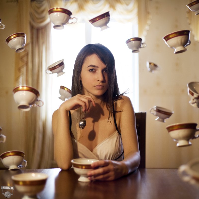
I feel even though I like these images I think they need to be darker to fit with my genre of rock. Also I think I need to make them more 'surreal' as it was a specific feature of my pitch.


I love photos like the two above, as they aren't posed they really show the model's natural beauty and their personality. These would be good photos to have in my DPS.
Wednesday 19 January 2011
Flat Drafts


These are two rough (disproportioned) drafts of possible magazine covers. I wanted to incorporate cards into the designs as they are quite a cool prop, however I'm not sure how well they will work and so will try them out in a mock of my magazine. Also I incorporate them talking influence from Alice in Wonderland which I think has many excellent artistic influences. In the first design the cards are showing a winning hand of 21 which I could use to emphasise my artist has won over the industry. In the second design the model is reaching out to the ace of spades it is an iconic card. Around the rest of the image I have the idea to photoshop cards falling. The cover lines on both are kept to a minimum which I think is good as it doesn't clutter the page.

This is a draft of my contents page. I have decided to make an image the background of the page and the text then sit over the top, like in the Vibe contents page I analysed.

Monday 17 January 2011


Inspirational Images
 I like the dark make up that contrasts her skin tone used by this girl in her photo.

The mouse ears are a good use of interesting props and this is added to by her make up. It still keeps the model fashionable with her glasses though.


Good use of head angles.


Blood - fits with genre, dark, sinister, surreal

Nice coloured photograph, and use of props and fashion associated with genre.


Great use of editing to add to the images. Makes them very individual and eye catching

Tuesday 11 January 2011


Subscribe to:
Posts (Atom)