Showing posts with label Research and Planning. Show all posts
Thursday, 27 January 2011
Playing with Desaturation!
These first 3 images I have used the effect of desaturation and then increasing contrast. I think this works nicely and creates a dark, bold look, it also fits with the idea in my pitch of 'bright, muted colours'.
In this four example I have also increased the brightness to the picture really stand out!
Thursday, 20 January 2011
Artist Profile
Artist Name: Zoe Pacific
Age: 19
Band Name: North SkY
Debut Album: Greatest Hits
Years Active: 2011-
History: The three members formed the band at college when they were 16. They busked on the streets of their city of Leicester and finally started performing gigs and battle of the bands in small local venues. After they finished college, in 2010, they all committed to the band and fought for meetings with producers, until one finally realised their talent. Shortly after that at the beginning of 2011 they released their incredibly successful album Greatest Hits.
Philosophy: Live life following any passions
Inspiration: Life, Space, The Sky, Friends
Musical Influences: Green Day, The Horrors, Good Charlotte, David Bowie, The Sex Pistols and The Who
Wednesday, 19 January 2011
Flat Drafts

These are two rough (disproportioned) drafts of possible magazine covers. I wanted to incorporate cards into the designs as they are quite a cool prop, however I'm not sure how well they will work and so will try them out in a mock of my magazine. Also I incorporate them talking influence from Alice in Wonderland which I think has many excellent artistic influences. In the first design the cards are showing a winning hand of 21 which I could use to emphasise my artist has won over the industry. In the second design the model is reaching out to the ace of spades it is an iconic card. Around the rest of the image I have the idea to photoshop cards falling. The cover lines on both are kept to a minimum which I think is good as it doesn't clutter the page.

This is a draft of my contents page. I have decided to make an image the background of the page and the text then sit over the top, like in the Vibe contents page I analysed.
This is my rough draft of the double page spread. I have tried to incorporate both of the DPS's I analysed using columns in the text however splitting the pages into image and text. I have drawn more than one image to help the personality of my artist come across.
Monday, 17 January 2011
Inspirational Images
The mouse ears are a good use of interesting props and this is added to by her make up. It still keeps the model fashionable with her glasses though.
The forrest setting of this photo is good as it is quite dark and sinister. The editing makes it really stand out and look different.
Good use of head angles.
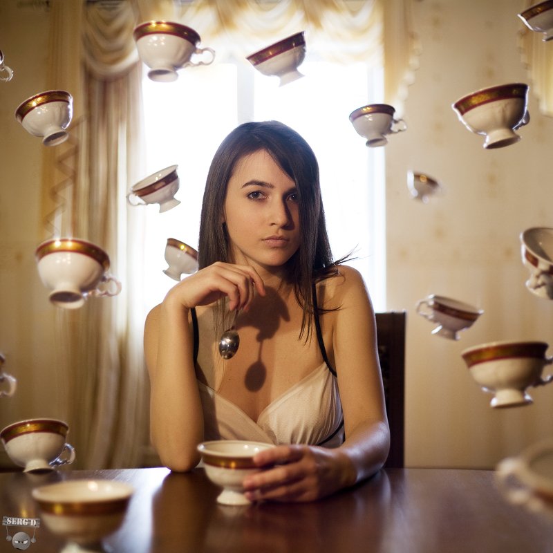
I really love this photo because not only does model look incredible with perfect hair and clothes which fit the genre but it involves the surreal element I want and action as though the photo was not know about.Blood - fits with genre, dark, sinister, surreal
Nice coloured photograph, and use of props and fashion associated with genre.
Great use of editing to add to the images. Makes them very individual and eye catching
Monday, 20 December 2010
Contents Page Analysis
This contents page is one from Q magazine. In the top left hand corner we can see the magazine logo which is very recognisable, and instills the magazines identity. The bold red backgrounds around the sub-headings help to make them stand out which allows the user to easily find the main contents and the large red numbers also help them find each part of the magazine and which part which part will interest them. The contents is in a column form which makes the contents easy to read, it also creates a good layout for the page as everything fits together neatly. The 'Oasis Special' box is a good idea because as it singles them out it will attract their fans and they can then go to the specialised pages. The main image on the page is regarding one of the main articles. Using a large image on the contents draws attentionto the main article. Also good idea is to number this article on the picture using a tagline directly from the article. The review section is helpful to the music fans of an established magazine like Q as they will trust them and enjoy their opinions. The use of another image is good as it will draw the eye to this section and it directly address those who are already fans of this artist.
The next contents page I have chosen is from Vibe magazine. I like this page as it makes the image the focus. I like this because it makes the page more interesting and animated than just having mainly writing. Having more interest on a page draws a reader in to actually pay attention to the page. Another main point of the page is the title 'Contents'. It is arranged in a very different way which also adds more to the page to attract the readers attention. The actual contents listing, like the rest of the page, is very simple with only a few sub-headings and then mainly one word pieces to go along with the numbers. It allows the reader to know what is in the magazine without making it too busy which can confuse readers. The colours used are also very simple as they are monochrome, black(and white in the image). The simplicity also adds elegance to the page which makes the magazine look good, this elegance will probably reflected throughout the magazine.
This contents from Drummer magazine is a design I really like. It includes features from the previous pages like the simplicity of images and text and the large masthead from the contents to instil the identity of the magazine. The main features of the page are the images. The largest imaged is obviously relating to the main article of the magazine and it includes the word 'Exclusive' on it to plug the article and draw in the reader. The other images surrounding the page also help to plug their relating articles. The numbers on the images are bright and bold which easily focus's the reader as to what page the article is on. The main contents listings is in a singular column, this allows more space for the images which I feel attracts a reader more than text does as the flick through a magazine. The actual listings are quite detailed even though the numbers and headings are bold to instantly attract the reader there is a large amount of description to allow the reader to know what is in the article after reading the tag lines. I think using a tag line is a good idea as it means the reader will get an idea of what the article is about and gives them an incentive to read it.
Tuesday, 14 December 2010
Front Cover Analysis
These covers are all ones from the genre I have chosen, Rock, that inspire me and give ideas for my own cover.
Subscribe to:
Posts (Atom)